Too much information appears at once
When every metric, chart, filter and card competes equally for attention, users struggle to identify the most important insight.
Dashboard design services
We design responsive dashboards for SaaS products, internal tools, admin systems, analytics platforms and business applications. Every dashboard is shaped around the people who use it, the metrics they need to monitor and the actions they must take—helping teams move from cluttered screens and disconnected data to a clear interface that supports faster, better decisions.
We help businesses redesign cluttered, confusing or incomplete dashboards into interfaces that support monitoring, analysis, prioritisation and daily workflow execution.
When every metric, chart, filter and card competes equally for attention, users struggle to identify the most important insight.
Users should quickly understand what is critical, what is supporting information and what requires action.
Executives, operations teams, managers, analysts and administrators often require different summaries, controls and levels of detail.
Visualisation should improve understanding. Decorative or poorly chosen chart types can make data harder—not easier—to interpret.
A dashboard should not only display information. It should also support the relevant actions, next steps and navigation paths.
Important metrics, cards, filters and actions must remain understandable and usable across desktop, tablet and mobile views.
Complete dashboard design delivery
The final scope is shaped around your product type, users, data structure, workflow and visual complexity. The modules below show what a complete dashboard-design project can include.
Clarification of the user groups, tasks, metrics, reports, data sources and key decisions the dashboard must support.
Planning the main dashboard layout, content grouping, widget hierarchy, navigation logic and summary-to-detail flow.
Responsive UI design for dashboards, detail views, filters, states, tables, charts, cards and other data-rich components.
Selection and design of suitable chart types, comparison views, trends, breakdowns, summaries and record-display patterns.
Design of role-specific dashboards or modular variants based on permissions, responsibilities and data-access needs.
Reusable cards, filters, chart blocks, headers, tables, forms and interaction patterns that keep the product consistent.
Organised files, component states, annotations and responsive references prepared for frontend implementation.
Support for design refinements, additional modules or follow-up dashboards as the platform evolves.
Featured dashboard example
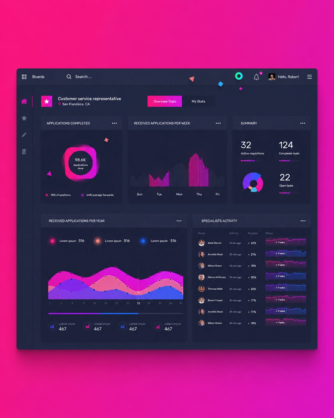
See how our dashboard design services transformed complex recruitment data into a focused interface for tracking applications, team activity and operational priorities.
Talent Operations Platform
We designed a central operations dashboard that gives recruitment teams an immediate view of application volume, active requisitions, completed tasks, open actions and specialist performance.
Frequently Asked Questions
These answers clarify the scope, UX, mobile readiness, systems and project process before a proposal request.
Dashboard design is the process of planning and designing an interface that helps users monitor important information, understand trends and take relevant actions. It includes layout, information hierarchy, charts, tables, filters, states and interactions.
Yes. Dashboards can be designed for SaaS platforms, admin systems, internal tools, analytics products, CRM interfaces, financial systems and other business applications.
We can help with the full dashboard-design process, including user needs, layout planning, information hierarchy, wireframes, chart selection and responsive UI design.
Yes. We can review an existing dashboard, identify usability and hierarchy issues and create a clearer redesign based on the users and reporting needs.
Yes. Different users can receive different dashboard views, metric groups, controls and data visibility based on permissions and responsibilities.
Yes. We help match the visualisation pattern to the underlying question or data behaviour so that charts improve understanding rather than create confusion.
Yes. Dashboard UI can be designed within an existing design system or alongside a new reusable component structure where needed.
Dashboard design can be delivered as a design service, and frontend development can also be scoped separately if you need implementation support.
Yes. Responsive behaviour is considered for cards, charts, filters, tables, navigation and key interface states across desktop, tablet and mobile screen sizes where relevant.
Early design can still begin around the user tasks, approximate content structure and likely reporting patterns. Final refinements can be made once the data model or API output becomes clearer.
The timeline depends on the number of screens, user roles, modules, filters, states, chart patterns and review rounds. A realistic delivery schedule is provided after the scope is confirmed.
Yes. Additional modules, reports, role-specific views or UI refinements can be supported through a follow-up design or ongoing product-support arrangement.
Plan a clearer dashboard
Share your product type, user roles, reporting needs, current interface challenges and expected scope. We will review the requirement and recommend a practical next step.
Provide a few details about the users, metrics and interface requirement, and we will respond with the most suitable next step.