The same component looks different across screens
Buttons, inputs, cards, tables and modals may use different spacing, colours, sizes or interactions even when they serve the same purpose.
Design system development services
We create reusable design systems for SaaS platforms, dashboards, websites and custom web applications. By defining shared components, design tokens, interaction patterns and documentation, we help product and development teams reduce inconsistency, improve collaboration and build new interfaces faster without redesigning the same elements repeatedly.
We help teams replace fragmented interface decisions with a reusable design foundation that supports faster design, clearer implementation and a more consistent user experience.
Buttons, inputs, cards, tables and modals may use different spacing, colours, sizes or interactions even when they serve the same purpose.
Without a reusable library, teams spend time rebuilding familiar patterns instead of solving new product problems.
Unclear component behaviour, missing states and inconsistent specifications often create gaps between design files and production interfaces.
Every new screen becomes a separate design exercise when common layouts, patterns and components are not already defined.
Typography, colour, spacing, icons and interface behaviour may feel disconnected as the product expands.
Without documented standards, improving one part of the interface can create uncertainty about how the rest of the product should change.
Complete design system delivery
The final scope depends on your current product, team, platform complexity and implementation maturity. The modules below show what a complete design-system project can include.
Review of current screens, recurring patterns, inconsistencies, duplicated components and gaps between design and production.
Definition of colour, typography, spacing, radius, shadows, borders, grid behaviour and other reusable visual decisions.
Design of approved components such as buttons, forms, cards, tables, navigation, modals, alerts and data-display patterns.
Definition of hover, focus, active, disabled, loading, error, success, empty and responsive states.
Reusable patterns for forms, onboarding, filtering, search, settings, data management, dashboards and other recurring workflows.
Practical documentation that explains when, why and how each component or pattern should be used.
Organised Figma files, naming standards, component mapping and implementation guidance for the development team.
Recommendations for updating, reviewing and expanding the design system as the product and team evolve.
Featured design system project
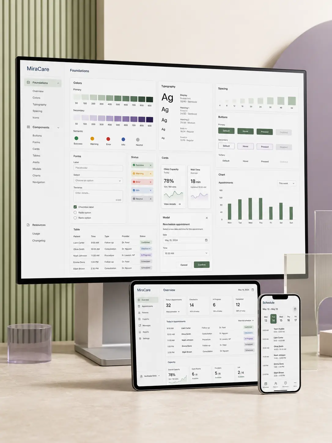
See how MiraCare gained a unified interface foundation for managing appointments, clinic capacity and staff schedules across desktop, tablet and mobile.
MiraCare Healthcare Operations
MiraCare needed its scheduling and operations tools to feel like parts of one product, regardless of the screen, user role or workflow being used.
Frequently Asked Questions
These answers clarify the scope, tools, alignment and delivery process before a proposal request.
A design system is a shared collection of visual foundations, reusable components, interaction patterns and documentation used to create consistent digital interfaces.
A style guide typically focuses on visual rules such as colour, typography and branding. A design system also includes functional components, states, product patterns, implementation guidance and maintenance processes.
Yes. We can audit the existing interface, identify recurring components and inconsistencies, then organise the strongest patterns into a reusable system.
Yes. Design systems can be structured as reusable Figma libraries with components, properties, variants, variables, documentation and usage examples.
Yes. Existing brand colours, typography, iconography and visual principles can be translated into a practical digital-interface system.
Yes. We can coordinate naming, variants, tokens, responsive states and component mapping with your development approach. Actual frontend implementation can also be scoped separately.
A full enterprise-scale system may be unnecessary for a small product, but a focused foundation and core component library can still improve speed and consistency.
Yes. Multi-brand, light-and-dark theme or white-label requirements can be considered, but they increase the token, component and testing complexity.
Relevant focus, error, disabled, contrast and interaction considerations can be included. Formal accessibility certification or legal compliance review should be handled separately where required.
Yes. Existing product screens can be improved as part of the audit and systemisation process, although the number of redesigned screens should be defined in scope.
The timeline depends on the size of the existing product, number of components, required documentation, responsive complexity and review cycles. A realistic delivery schedule is provided after the initial audit.
Ownership should usually be shared between designated design and development representatives. We can recommend a governance model based on your team structure.
Yes. New components, refinements, documentation updates and adoption support can be provided through an ongoing design-system or product-design engagement.
Build a stronger product foundation
Share your current product, design files, frontend stack, team structure and expected system coverage. We will review the requirement and recommend a practical audit or design-system scope.
Provide a few details about the product, existing interface and team workflow, and we will respond with the most suitable next step.